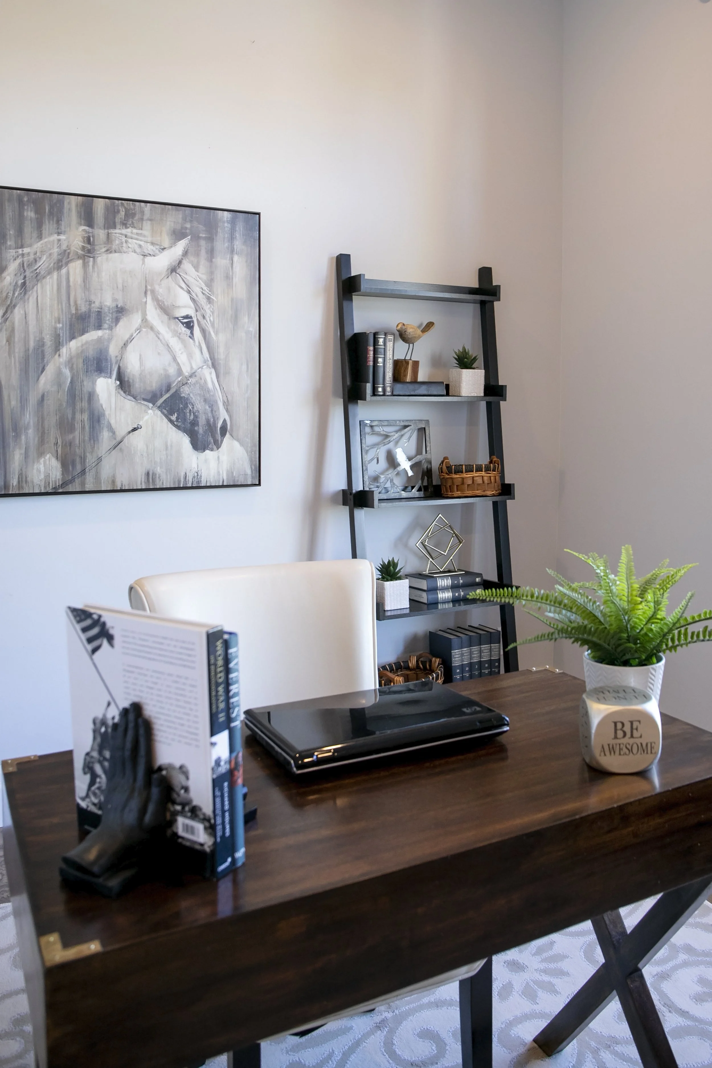
Every decorating or design professional will tell you that there is one aspect or technique that they love above the rest. For me, hands down, it’s shelf styling. Whether it’s in a home for selling or dwelling, I get giddy at the thought of arranging and showcasing these creative features.
Shelf styling is a true art form that takes practice to perfect, but with these master techniques, you will be a pro in no time!
Mix Books and Decor
Utilize a mix of books with a variety of decorative items, staggering the books and décor to create a balanced look from shelf to shelf. Décor can even play double-duty when positioned as a bookend. Along with decorative items, baskets, plants, and small artwork are a great way to style shelves for added variety and interest.
Selecting the Right Books
When selling your home, just like the spaces throughout your home, your bookcases and shelves should err on the side of neutral. Choose books with covers/spines that are more neutral in colour, then sort them by size. As a general rule of thumb, try to keep like-sized books together (both in terms of width and height). If you find that your book spines are overly colourful, considering turning your books backward so that the pages face out, as opposed to the spine. For living in your home, group books of similar colours together (and pair with complementary décor pieces).
Placement
Add dimension and depth to the shelves by keeping some books standing straight up and others laying down horizontally, using the decorative items in blank spaces on the shelves or placed on top of the books laying horizontally space allows. Group items in odd number sets and lean art or plates to fill the vertical space.
Balance
You will want to create balance in the distribution of items throughout the shelves. When working with multiple sets of shelves, be sure to incorporate a consistent flow and theme throughout. Create an element of symmetry by using similar-sized items in mirrored placement.
The goal is to create a “just full enough”, visually balanced look without the shelves looking too full or too empty, and avoiding an over-crowded look.
Whether you are working with built-in cabinets, mounted wall shelves, or freestanding bookcases, put these tips to work to create a dramatic impact and visual intrigue.


