green

Colour Trends 2010 - BTSH Around The House Tip of the Week

Touched on briefly in last week’s ATH, 2010’s colours are expected to add lots of excitement to our homes. Big and bold is where we’re headed. Be fearless with colour, and break all the rules. Here are some hot colours to watch for:

Green
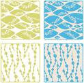
We started to see the emergence of “green” in 2009 in both colour and eco-awareness. This will continue for 2010, “Olive Green”, the traditional colour for peace, taking center stage as this year’s hottest hue, giving a kickback to the 70’s and keeping with the return of retro. Remember the green and gold appliances we saw in the 70’s? Find these colours returning in furniture and accent pieces! Combine the retro with modern by pairing green with a fresh pink. Choose a lime green and a soft pink for a bold statement, such as Fussy Pink and Clean Green from Sherwin Williams. Did you know? Green is considered the most restful colour for the eyes.

Yellow
Bright and bold, look for yellow as a room feature or as an accent colour. Classic white contemporary will be warmed with a touch of yellow. Also see yellow take centre stage in kitchens, as it is often associated with food. Yellow produces a warming effect, arouses cheerfulness and stimulates mental activity. Use this colour in any room in your house, from kitchen to bath, office, or child’s room. Did you know? Yellow is the first colour that kids will tend to reach for! Yellow is the color of sunshine. It's associated with joy, happiness, intellect, and energy. Brighten up a room in your home is my favourite yellow, Lemon Meringue by Benjamin Moore.

Artisan Inspiration
Earth inspired colours from around the globe, especially Asia and India, will emerge as hot colours. Invoke some old world charm to your home with a blend of teal, orange, and gold. Orange combines the energy of red and the happiness of yellow and is associated with joy, sunshine, and the tropics. Whether you have traveled the world, or just dream of reaching a foreign land, the bold colours will transform any room into a great escape. Indian Maize from PPG Pittsburgh Paints is a nice gold, pair with Opulent Orange from Behr Paints.

Neutrals No Longer Boring!
Not sure about the big and bold, but still want to update the boring beige? Consider using neutrals that step away from the standard grays and taupes. Instead look to spruce up a neutral room with soft hues of lemon yellow and pale blue. Mauve is another peace inspiring colour that will help to brighten up the neutrals. Look for Studio Mauve from Sherwin Williams to break away from traditional.

Written by Shauna Lynn, Beyond The Stage Homes
www.beyondthestagehomes.com

Setting The Trend for 2010 - BTSH Around The House Tip of the Week

Lots of fun and exciting trends emerge for 2010. Some began their appearance first in 2009, but we will see them reach a new level in 2010. Get ready for more “green” products, both in colour and eco-awareness, as well as a break from the modern contemporary to add some warmth, coziness, and colour to the traditional contemporary style. Colours will reflect some retro appeal, and appear big and bold (more on this in next week’s ATH article). As well, accent walls make a grand return, with lots of different styles and textures explored. The big theme for 2010 will be mixing it up. Forget the rules you knew when it came to decorating, and feel free to be creative and expressive in colours, patterns, and styles.

Accent Walls
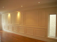
While accent walls have been around for a while, 2010 you will see lots of different styles and textures in accent walls. While a simple bold colour can still be seen as a great accent, other materials such as wallpaper, which began its return in 2009, will be much more prominent. Look for bold patterns, as well as paintable wallpapers that add even more texture to a room. Accent walls will also feature textures such as grasscloth in various styles and patterns, and wainscoting, as seen in the image to right.

Textures
Not limited simply to the walls, textures will add a sense of comfort to a room. Layer and mix various fabrics such as wool, velvet, organic fabrics, furs, and even leathers. Also, as wallpaper makes it’s big comeback look for wallpapered ceilings to add texture to any room.

Bold Mix of Patterns
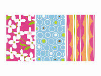
Another way to add texture will be through patterns. Forget symmetry. Who says you can only have one pattern in a room? Mix and match various patterns, such as stripes with paisleys and flowers with checkers. Have fun with patterns in your walls, textiles, and accent pieces.

Mix High with Low
If there is one great thing that emerged from our most recent recession, it’s the importance of “thrifty” living and sustainability. 2010 will feature a great deal of re-purposing, keeping with the eco-friendly theme, as well as adding character. To avoid looking like a thrift-store junkie, mix select high-end pieces with the classic refurbished pieces. Again, showcasing the retro theme, and mixing the old with the new.

Original Art
Another trend that the recession inspired was do-it-yourself artwork. While I love to support local emerging artists, I also appreciate the uniqueness and originality of this new art trend. Consider painting a wall with chalk board paint to allow the freedom to change up quotes and images as often as you like. Encourage your guests to contribute to the masterpiece. Or purchase word decals to create a phrase to reflect your home’s style and your personality. Various sites online to order from.

Written by Shauna Lynn, Beyond The Stage Homes
www.beyondthestagehomes.com

Thrift Store Finds - BTSH Around The House Tip of the Week

Ok, so it’s not exactly a secret that I spend my spring hunting around at garage sales, and the rest of the year I can be found often at various thrift stores throughout town. I am also a bit of a kijiji junkie. I like to find good quality items with potential, and transform them into something great. Here are a few reasons why I’m addicted to thrift, as well as my latest finds.

One of a Kind

I suppose technically the item itself, in it’s original condition, may be one of many. Chances are however that this item can no longer be purchased in stores. The more vintage the item is, the better your chances are that you will not walk into your friends house and see that she has the same vase, picture, plate, whatever! I love IKEA, and Pier 1, and of course Crate and Barrel (welcome to Canada CB). They have new innovations all the time, and have a team of extremely talented designers working hard every day to create the next big thing in home fashions. Nonetheless, there is nothing more frustrating then walking into a home, and immediately recognizing their living room as page 32 of the latest IKEA catalogue, or worse yet, seeing a mirror of your own home! My best advice, when shopping at any of these stores, is moderation. Pick a few select items from each store, but be sure to add variety, and a little of your own personality into each one.

Repurposing is a GREEN idea

This is a fairly common theme to my articles, but I cannot stress enough that you do not need to be a hardcore environmentalist to think green. I myself am not, however I am always looking at ways that I can make a difference. Whether it’s as simple as applying some paint to give an item a facelift, or finding a whole new use, such as making a planter for your garden out of an old barrel, by repurposing second-hand items, we are giving them new life, and reducing the waste that would be sent to landfills.

Saving Money

While some may look at thrift stores with the idea of saving money as their top priority, you can shop for unique finds no matter what your budget. As well, being thrifty isn’t just about buying thrift items. You can do your part simply by donating to your local thrift stores. For large items that you don’t want to just give away, I definitely recommend using www.kijiji.ca. It’s a free classified site, and you can buy or sell pretty much anything. Why not make some money from those unwanted items you have around your house. One person’s trash really is another’s treasure. And speaking of treasures, check out some of my latest thrift store finds (pictured on the left)! Stay tuned to upcoming articles as I show you how I find purpose for these one of a kind pieces.

Written By: Shauna Lynn, Beyond The Stage Homes
www.beyondthestagehomes.com
The GREEN Movement - BTSH Around The House Tip of the Week

Choosing paint that’s right for you, and for the environment

2009 Colour Trends

If there is one colour we simply can’t get enough of in 2009, it’s gotta be GREEN!! That’s right, not just an eco-friendly idea, but top paint companies like ICI Dulux, and Benjamin Moore, agree that green is the new beige. Green is a very serene and calming colour, and reminds us of natural elements and what our environment has to offer us.

One thing I cannot stress enough in decorating is that neutral does not have to mean builders beige. I am often caught reciting this to my clients. Don’t get me wrong, there are some wonderful neutrals in the taupe/beige family, but neutral does not have mean dull, lack-lustre, and boring. Feel free to add a touch of colour to your neutral.

In Home Staging especially, you will hear various ideas about the best way to show your home in order to maximize your profits. Decluttering and depersonalising are two that are undoubtedly and consistently true in every home. Depersonalising refers to taking down the family photos and knick-knack souvenirs from family vacations in an effort to allow potential buyers to envision themselves in your home. You’re essentially selling a product. Often this also can mean covering up the brightly painted walls as well. While you may want to live in a rainbow of colours, as I mentioned you are selling a product, and therefore it’s often a good idea to tone down the colours in your home to something more neutral. That being said, it’s unlikely that potential buyers will want to live in builder’s beige. Feel free to explore colours outside the beige family, provided it is a nice soft hue, such as a lemon yellow, or a light olive green.


What makes a paint an environmentally friendly “green” paint?


Paint has been given a bad rap for years, due to the fumes and chemicals that are put into the air from it, otherwise referred to as VOCs (Volatile Organic Chemicals). So how do you know if you’re choosing a green product? While many paint manufacturers claim to be green, very few actually are. Part of the inaccuracy of their claims stems from the vast number of certification organizations with a variety of standards. According to TerraChoice, an environmental marketing company that manages the EcoLogo program, organizations that can be trusted include EcoLogo, the Forest Stewardship Council (FSC), Green-e and Greenguard. If you’re unsure about a paint, look for the certification from one of these companies. Look for natural paints, or at the very least, zero to low VOC paints. The standards are continually evolving, and new methods are continually introduced for creating an environmentally friendly paint that will adhere easily, and is durable enough to stand the test of time. If you’re still unsure, ask your local paint professionals.

Written by Shauna Lynn, Beyond The Stage Homes
www.beyondthestagehomes.com